Your ADH
A brand built from the inside out. Starting with the people who live and work inside Your Adult Day Health every day, and ending with a visual identity that communicates safety, warmth, and home.
A brand built from
the inside out.
Adult Day Health programs exist for one specific reason: to give caregivers a break. The people who come to Your ADH every day are not the caregivers. They are the clients. Elderly and disabled individuals who need daily support, social connection, and care while the people who love them get the respite they need to keep going.
To build a brand that could speak to both groups, the families making the decision to bring someone in and the clients who would walk through the door every day, we started with the people already inside. We interviewed 10 program staff and 10 current clients to understand what this place actually meant to them.
Warm. Passionate. Compassionate. Safe. Those weren’t brand values we invented. They were the words people used to describe their experience. Every visual decision that followed was an answer to a single question: does this feel like those words?
Three ideas.
One symbol.
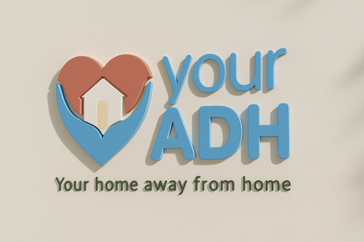
The direction was text-forward, grounded, and emblem-led. The wordmark uses a rounded typeface to signal warmth without sacrificing readability. The emblem does conceptual work. Every element inside it means something.
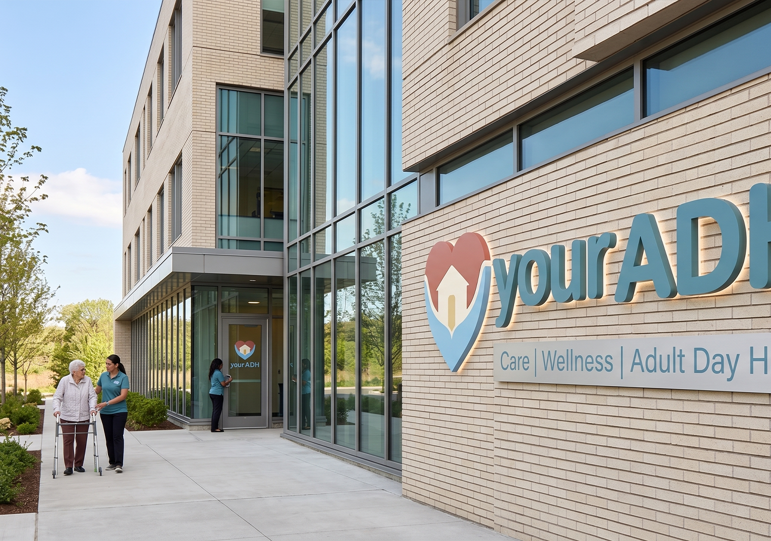
Helping Hands
The hands cradling the heart form the outer shape, with support and safety rendered as structure.
The Heart
Passion and compassion made literal. It anchors the emblem and communicates care at any size.
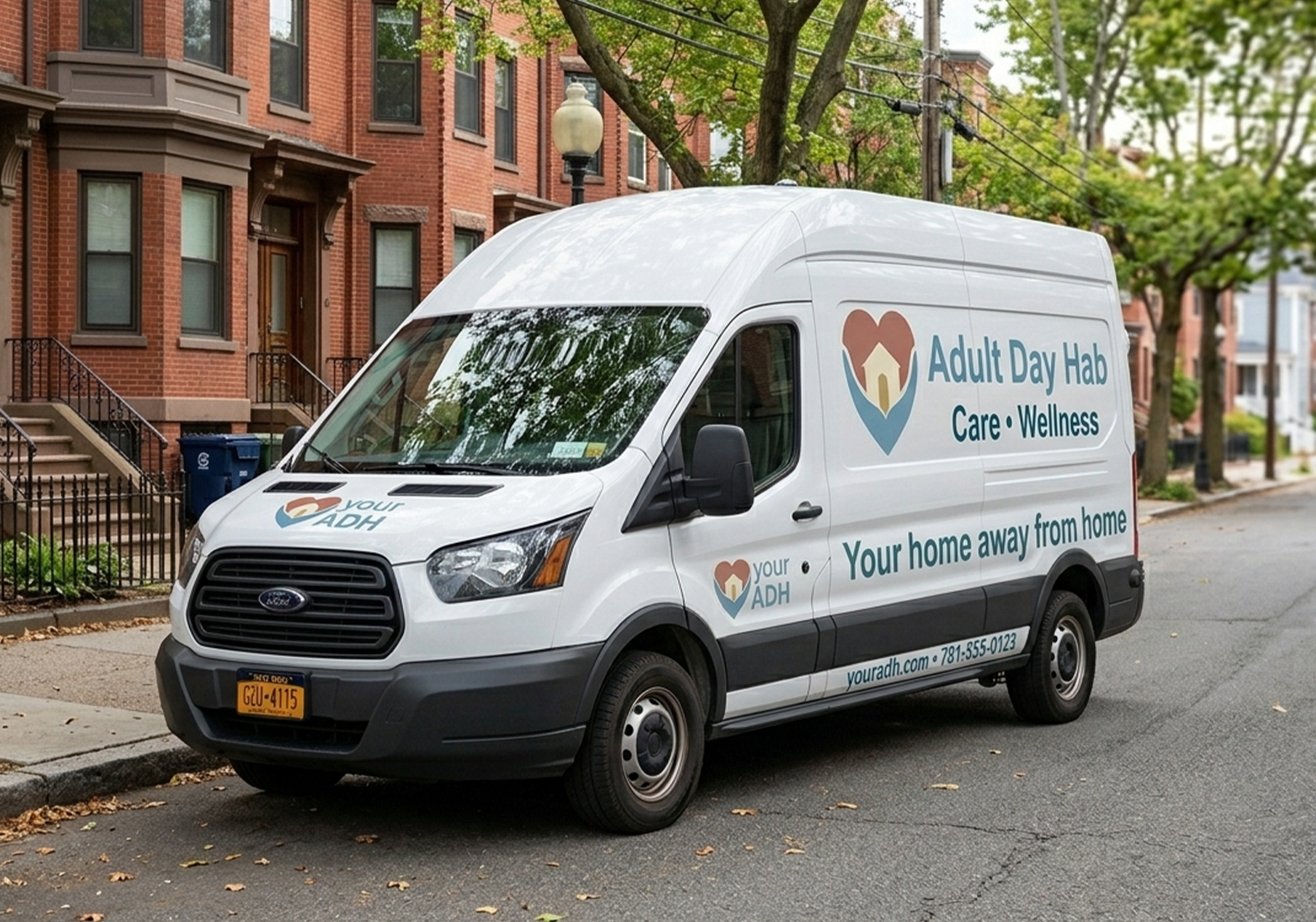
House with a Door
A home with an open golden door inside the heart. The tagline made visual. Always welcoming, always safe.
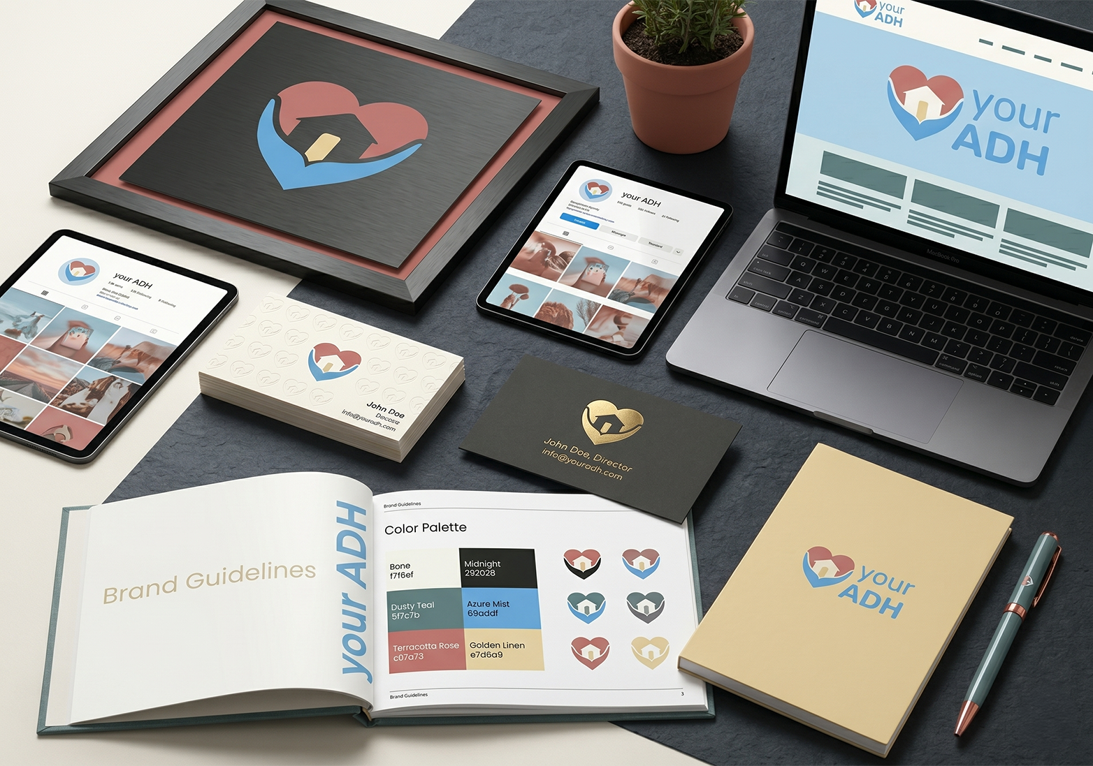
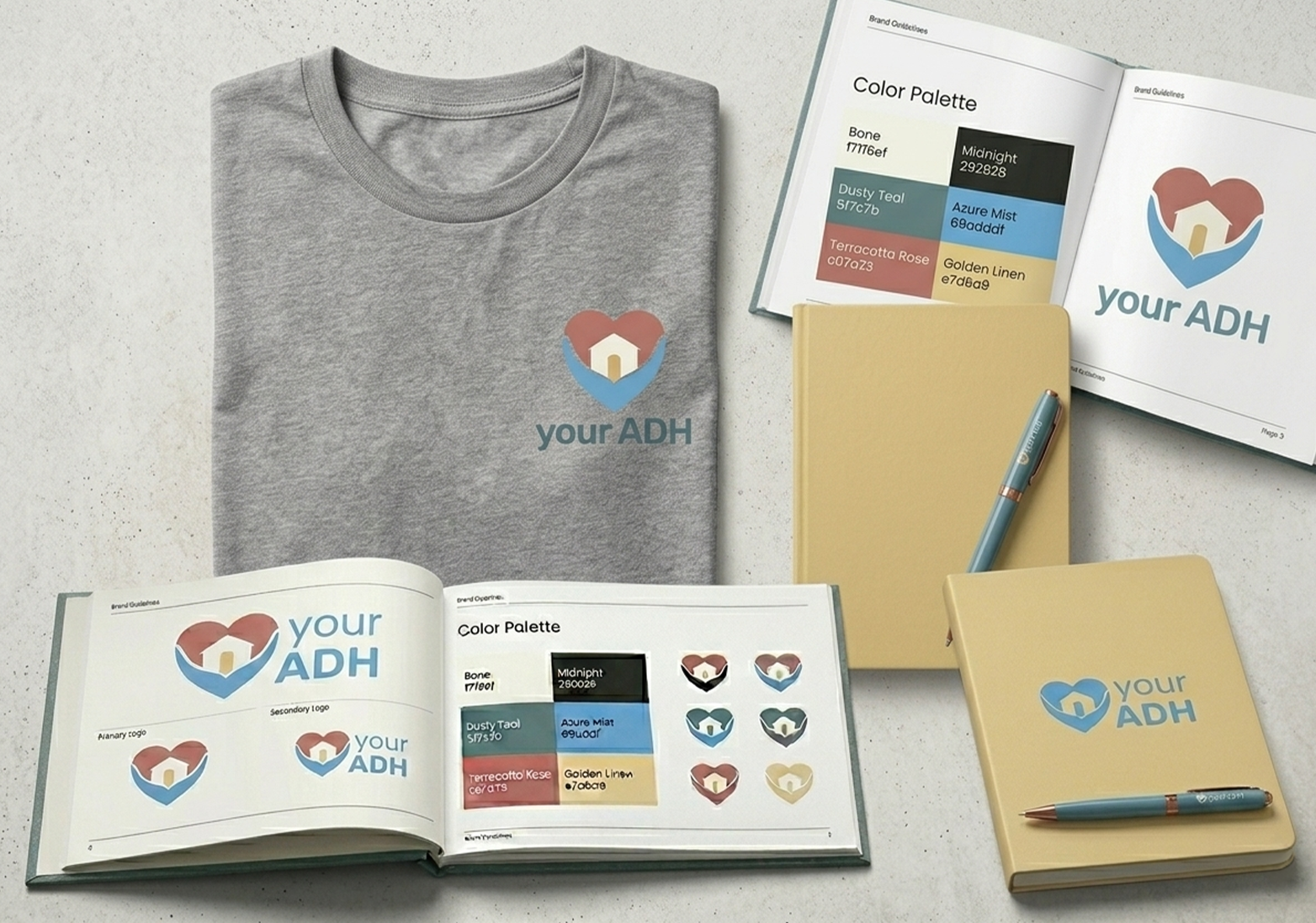
Every color
has a reason.
Each color was chosen to carry a specific emotional weight from the research keywords, grounded enough to communicate professionalism and warm enough to communicate care.
See the system
in action.
↑ Uncomment one line in the script below to activate video embed
From brief
to buildout.
I led the brand design in-house, running the research, facilitating insight synthesis, and translating keywords directly into visual decisions. With limited upfront direction, I built stakeholder consensus at each phase before moving to execution.
- Research design: staff and client interview facilitation
- Brand strategy and visual identity system development
- Logo concepting, refinement, and stakeholder sign-off
- Color system and typography selection
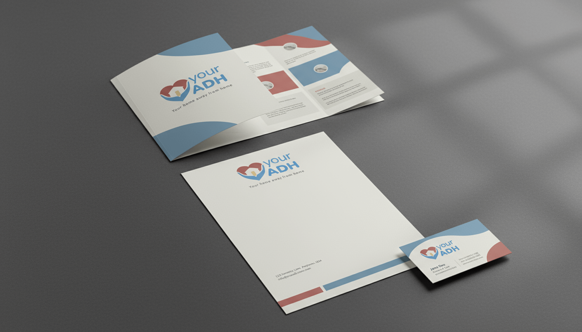
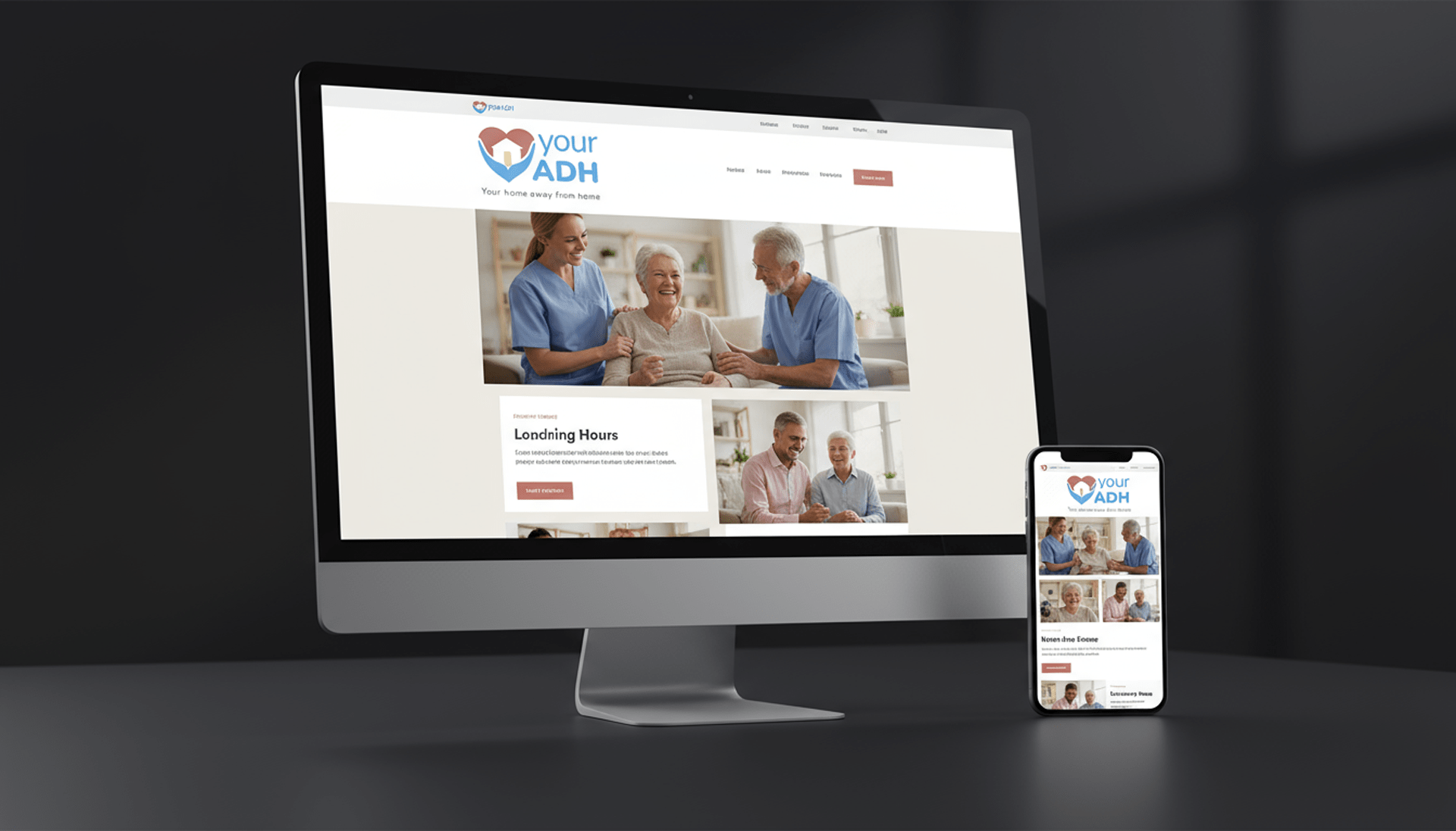
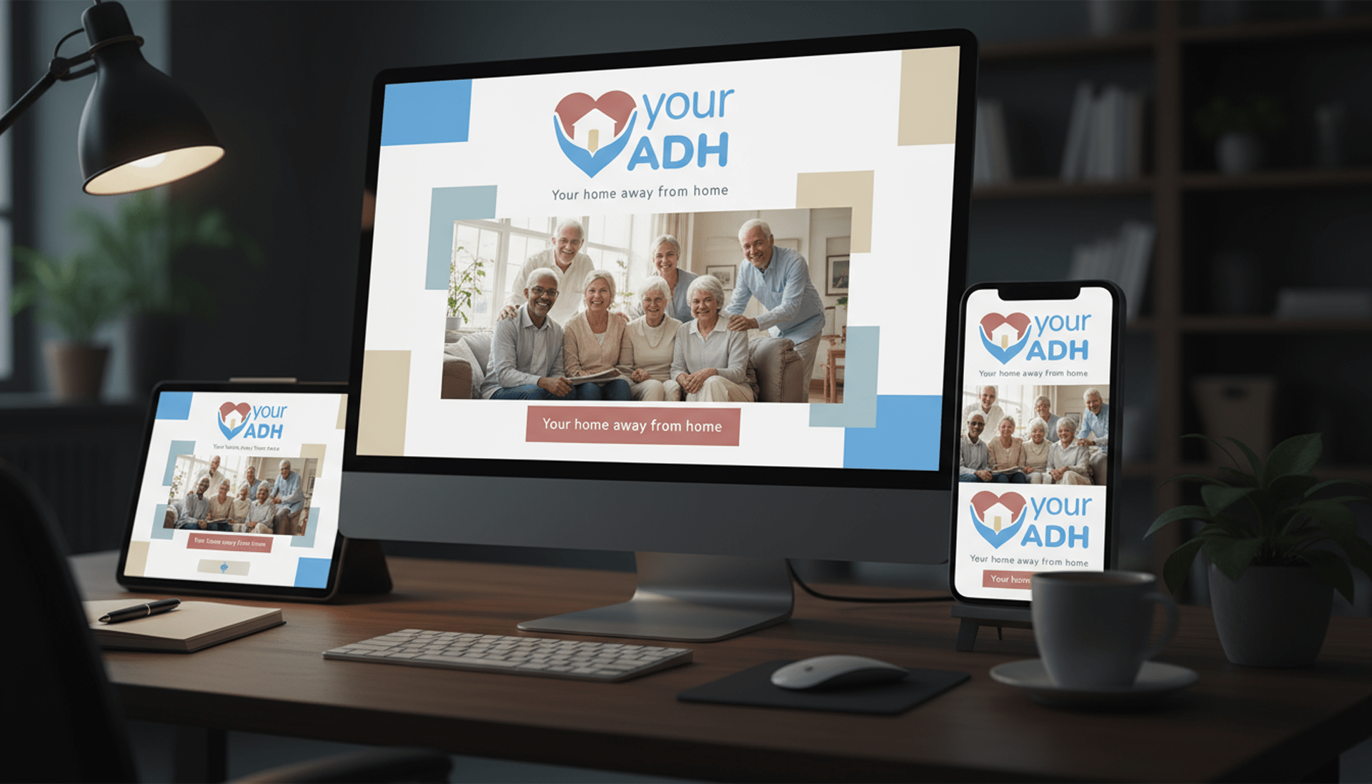
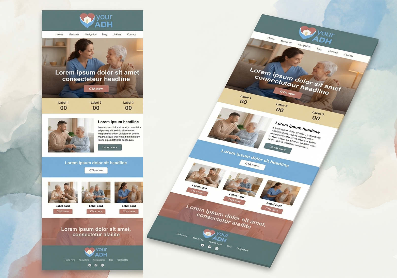
- Website design and build in WordPress
- Print and marketing collateral for launch
- Art direction across digital and physical touchpoints
Research & Discovery
10 staff + 10 client interviews. Five consensus keywords extracted: warm, passionate, compassionate, care, safe.
Identity Design
Logo concepting anchored in keywords. Emblem developed to carry three simultaneous concepts: hands, heart, home.
System Development
Color palette, typography, and rules, all mapped back to research keywords, not aesthetic preference alone.
Web & Collateral
Full WordPress build plus print assets. Brand guide delivered for ongoing use by the team.