Vitra Health
Inherited a brand skeleton and elevated it into a full digital presence. New web build, refined identity, and a content system built to scale.
ROLE
UX Strategy, Information Architecture, Web Design
SCOPE
Discovery, IA, Brand System, Responsive Design
INDUSTRY
Home Care & Healthcare Services, Massachusetts
LIVE SITE
vitrahealth.com →THE BRIEF
Helping families navigate a system that’s hard to understand.
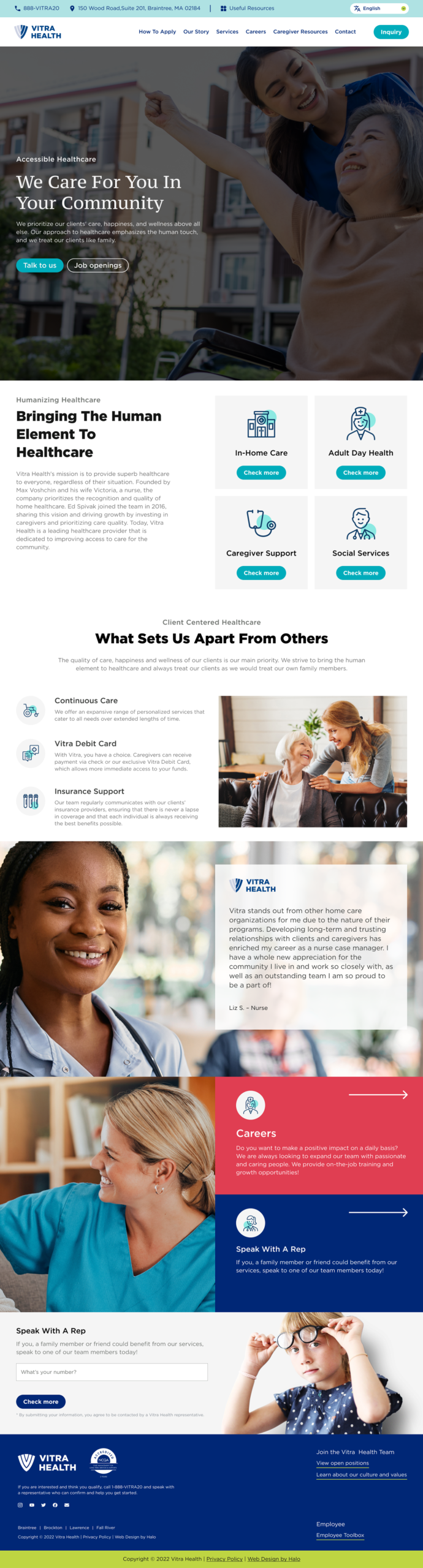
Vitra Health provides government-funded home care programs to elderly and disabled individuals across four Massachusetts communities. Their programs keep families together by compensating caregivers and pairing them with nurse case managers. The work is meaningful. The website was not doing it justice.
The original site had a shallow information architecture with no clear pathways for its three distinct audiences: caregivers looking to get paid, patients and families navigating eligibility, and B2B referral sources like hospitals and insurers. Content was disorganized, navigation was ambiguous, and the site failed to reach the communities it most needed to serve.
The engagement grew from a visual refresh into a full UX project. Discovery through sitemap restructure through final design delivery and the goal was a website that could earn trust from people making difficult decisions under real pressure.

Process
Strategy first. Design second.
01
Discovery
Audience mapping across three user groups: caregivers, patients, and B2B referral sources. Competitive analysis against regional healthcare organizations. Brand values extraction and multilingual requirements scoped.
02
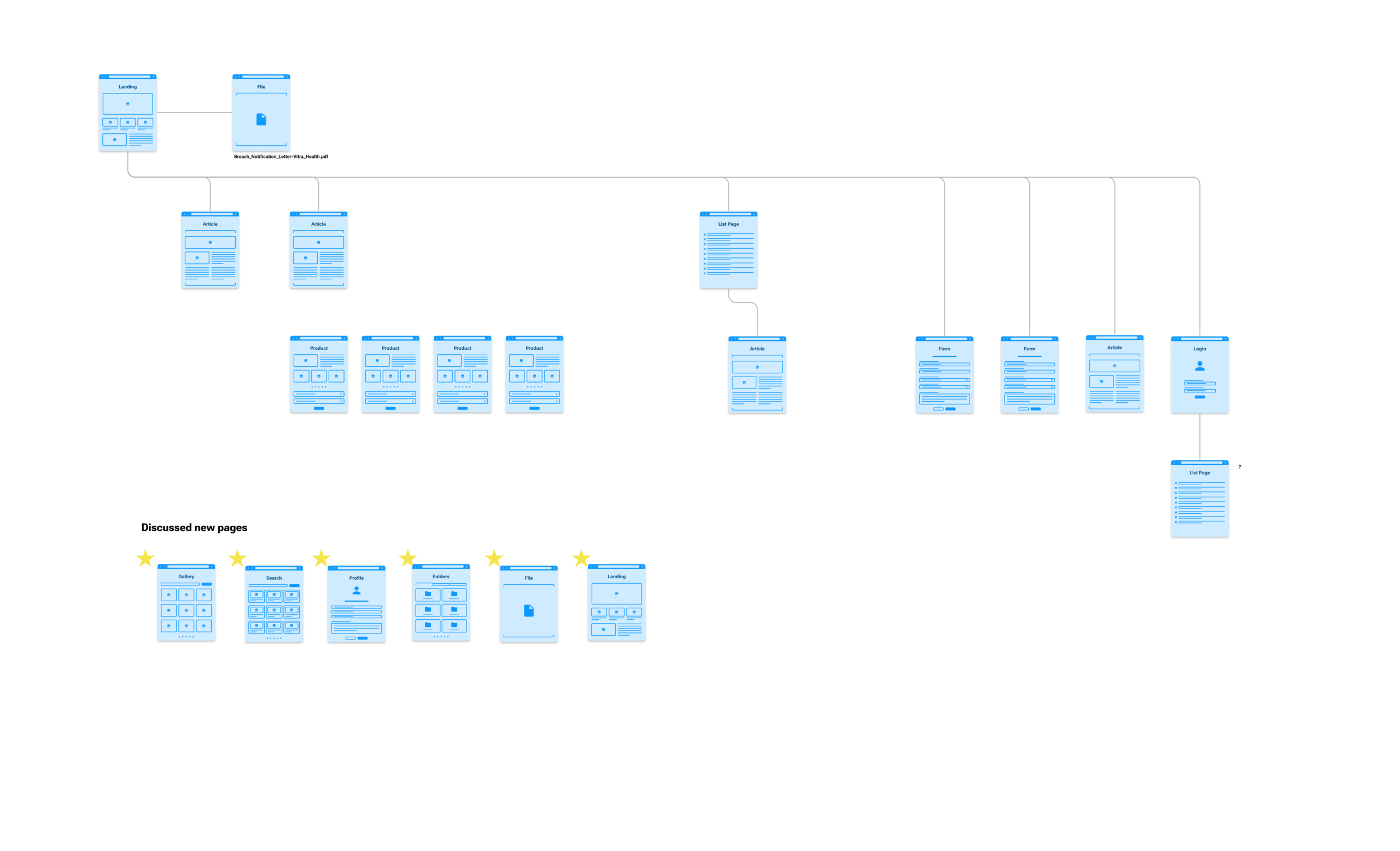
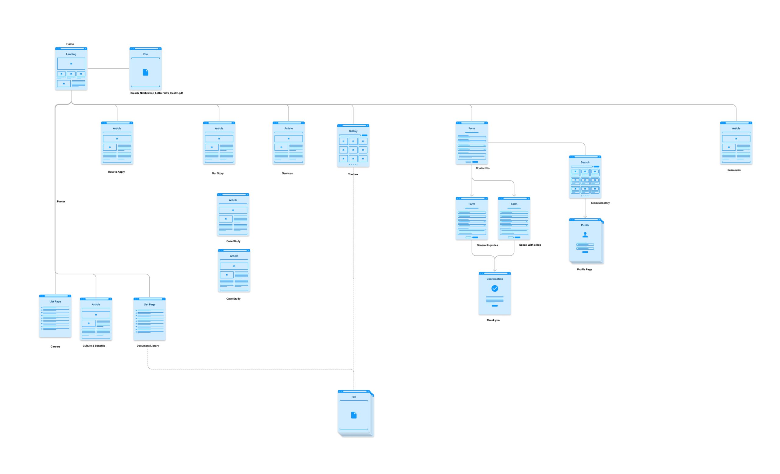
Information Architecture
Mapped the existing site's shallow structure and rebuilt it from scratch. Defined 20+ page types including Document Library, Team Directory, Program Case Studies, and split Contact flows.
03
Brand System
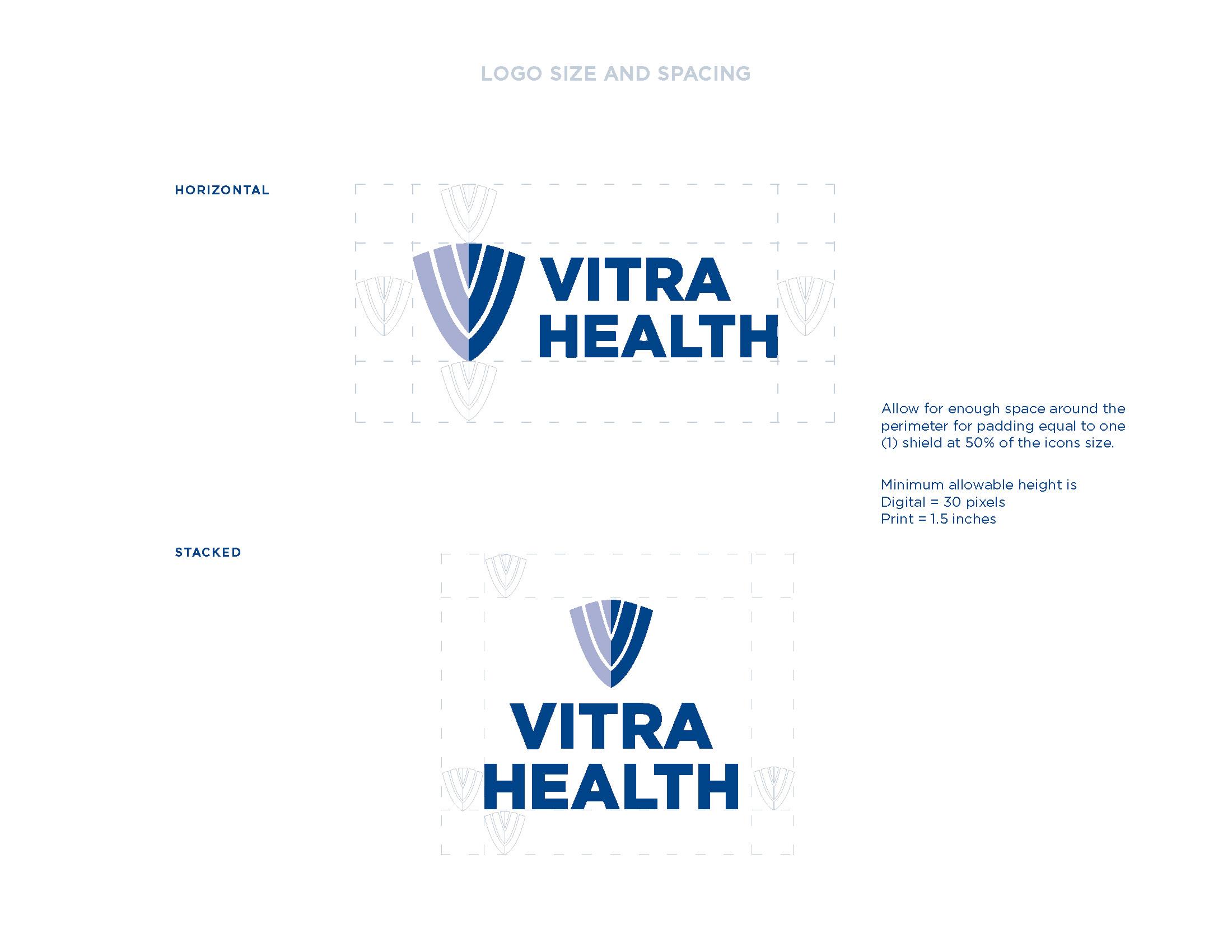
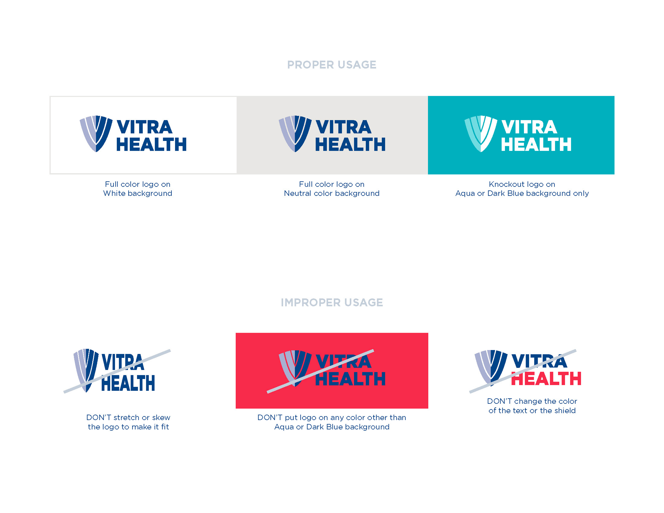
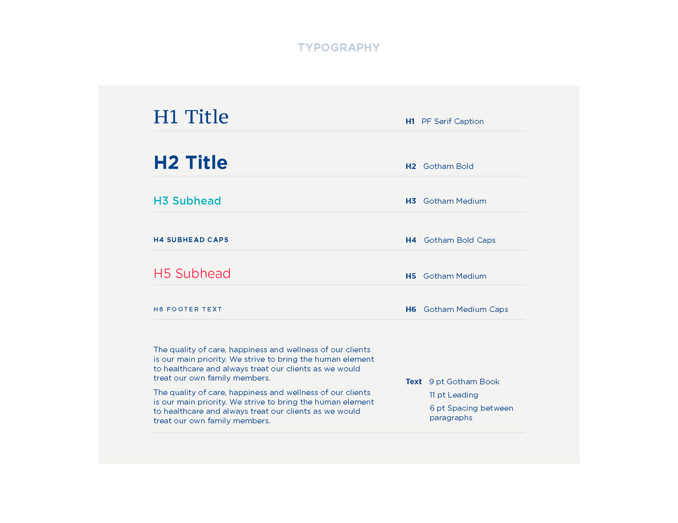
Color palette, typography, logo usage rules, and proper and improper usage guidelines documented and delivered as a formal branding guide for ongoing use by the team and future vendors.
04
Web Design
22+ frames designed across desktop and mobile, including service pages, content pages, forms, and employee-facing tools. Full design-for-development package delivered with component library and asset exports.
Information Architecture
From five pages to a full site system.
The original site was five pages deep with no clear navigation logic. The proposed architecture expanded to 20+ pages, organized around clear user journeys for each audience type, with dedicated pathways for applying, learning about services, finding a team member, and accessing resources.
Brand System
Warm authority. Built for trust.
The Vitra palette leads with Dark Blue and Aqua, signaling professionalism and accessibility in healthcare contexts. Lime Punch and Warmer Red function as action and alert accents. The full branding guide documents color, type, logo usage, and do/don't guidelines for consistent application across all touchpoints.